Project

1 / 18

Vellutto

Branding

UI and UX

Front end and back end

SEO and GEO

Photography and film

2026

The question

How does an online store earn the trust of someone about to buy a high-end espresso machine, and how does that buyer find the store in the first place?

The task

Vellutto is an online store in Bussum, the Netherlands, for high-end espresso machines and grinders. Its old store ran on Wix and lacked full functionality. It was Dutch by default, and on desktop its product page showed no price or cart button on the first screen.

Map It was asked to improve it: better looks, better UX, a stronger presence online, and organic traffic from Google, Bing and other search engines. The store had to be readable and well structured, for people and for AI assistants.

We built the store on Shopify, on the Concept theme, which we chose and configured. We also made the marketing and presentation materials, including a big share of the product photos and the Wendougee DATA S film.

How we studied it

We interviewed the owner, talked with real buyers, studied competing stores and the market, reviewed the old Wix store, and analysed shop data and session recordings.

With that in hand, we set what a product page shows first, where the trust lines sit, and how a buyer reaches a person.

The obstacles

  • The old store ran on Wix and lacked full functionality, so we built a new store on Shopify, on the Concept theme, which we chose and configured to fit Vellutto.

  • A high-end purchase needs trust, so the product page follows one order, from price and rating at the top to dispatch, cool-off, warranty and free EU and EEA shipping below the cart button.

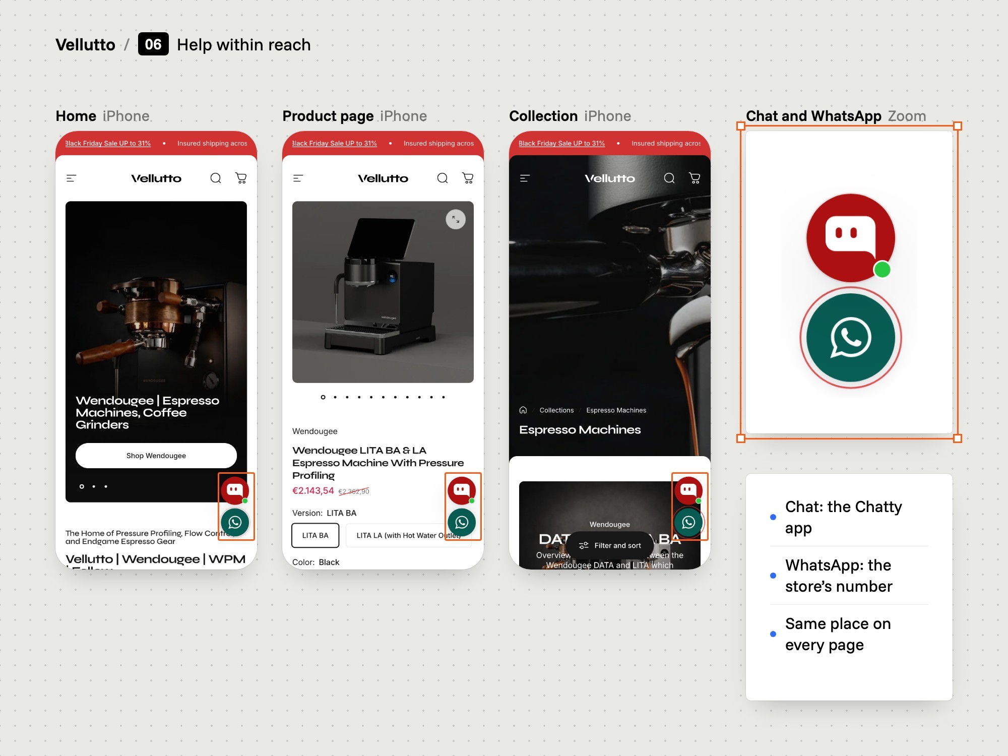
  • Buyers have questions before they pay, so we placed chat and WhatsApp buttons on the store's pages.

  • Buyers need to know which machine suits them, so the copy says in plain sentences what each machine does and who it is for.

  • Search engines and AI assistants had to read the store, so we wrote clear copy, page titles and descriptions, a buyer FAQ in plain sentences and a fact sheet for AI assistants (llms.txt).

  • The brands and the manufacturer supplied only part of the product media, so Map It made a big share of the product photos and shot and edited the Wendougee DATA S film.

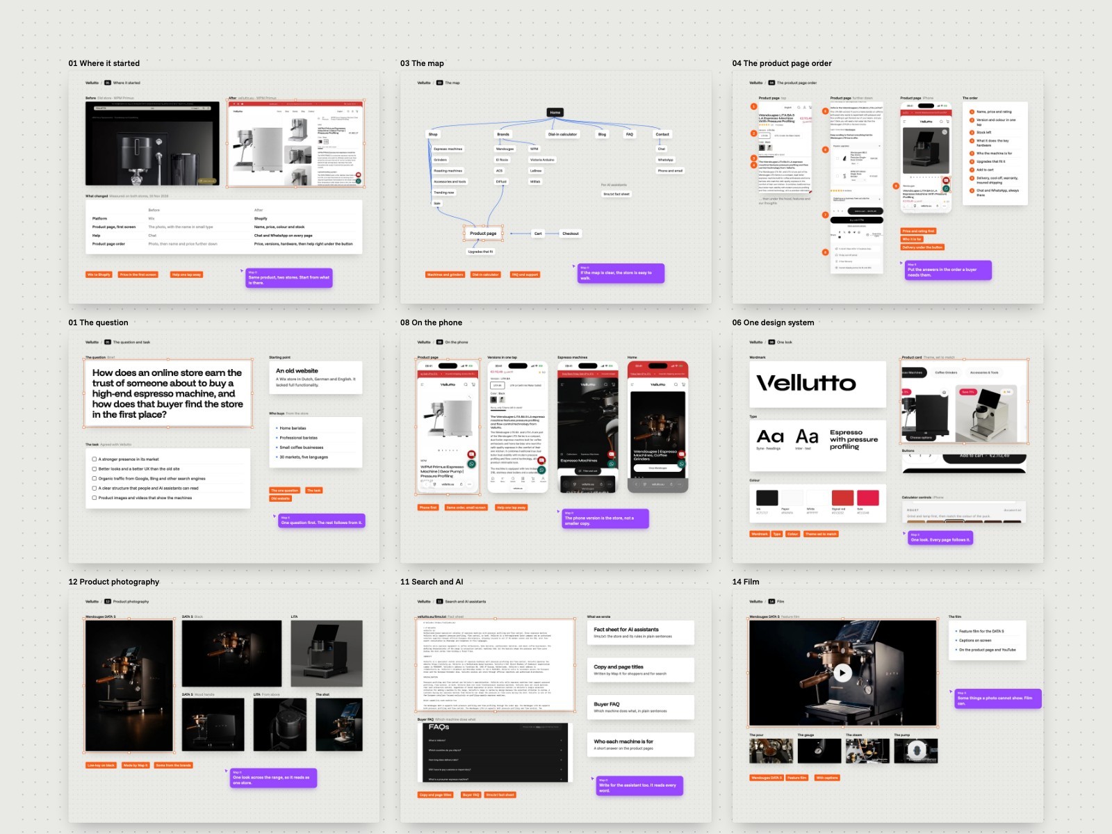
How Vellutto was built

Fourteen steps, from the first owner interview to a Shopify store that went live in spring 2026.

1Understand
A board with the Vellutto brief: the question and the task.
The brief, pinned up
01

The brief

We interviewed the owner and wrote down what the new store had to do.

  • Owner interviews
  • Old Wix store
  • The task set out
The problem
Vellutto sold espresso machines and grinders from a Wix store at finesseproduction.eu. The site was Dutch by default, although its home title offered shipping within the EU.
Our thinking
The owner hears buyers' questions, objections and return reasons first hand. That knowledge comes before any design.
What we did
We interviewed the owner and set the task: a new store with better looks and UX, organic traffic from Google and Bing, and pages that people and AI assistants can read.
How we did it
Interviews with the owner about what buyers ask, what makes them object and why they return products.
What changed
The store now runs on Shopify at vellutto.eu, with English as the default language.
The old Vellutto site on Wix: a photo-led home page and a product page on a phone.
The old Wix site, desktop and phone
02

The old site

We reviewed the old Wix store and listed what its product page hid or left out.

  • Price below first screen
  • No trust lines at cart
  • Free shipping: three countries
The problem
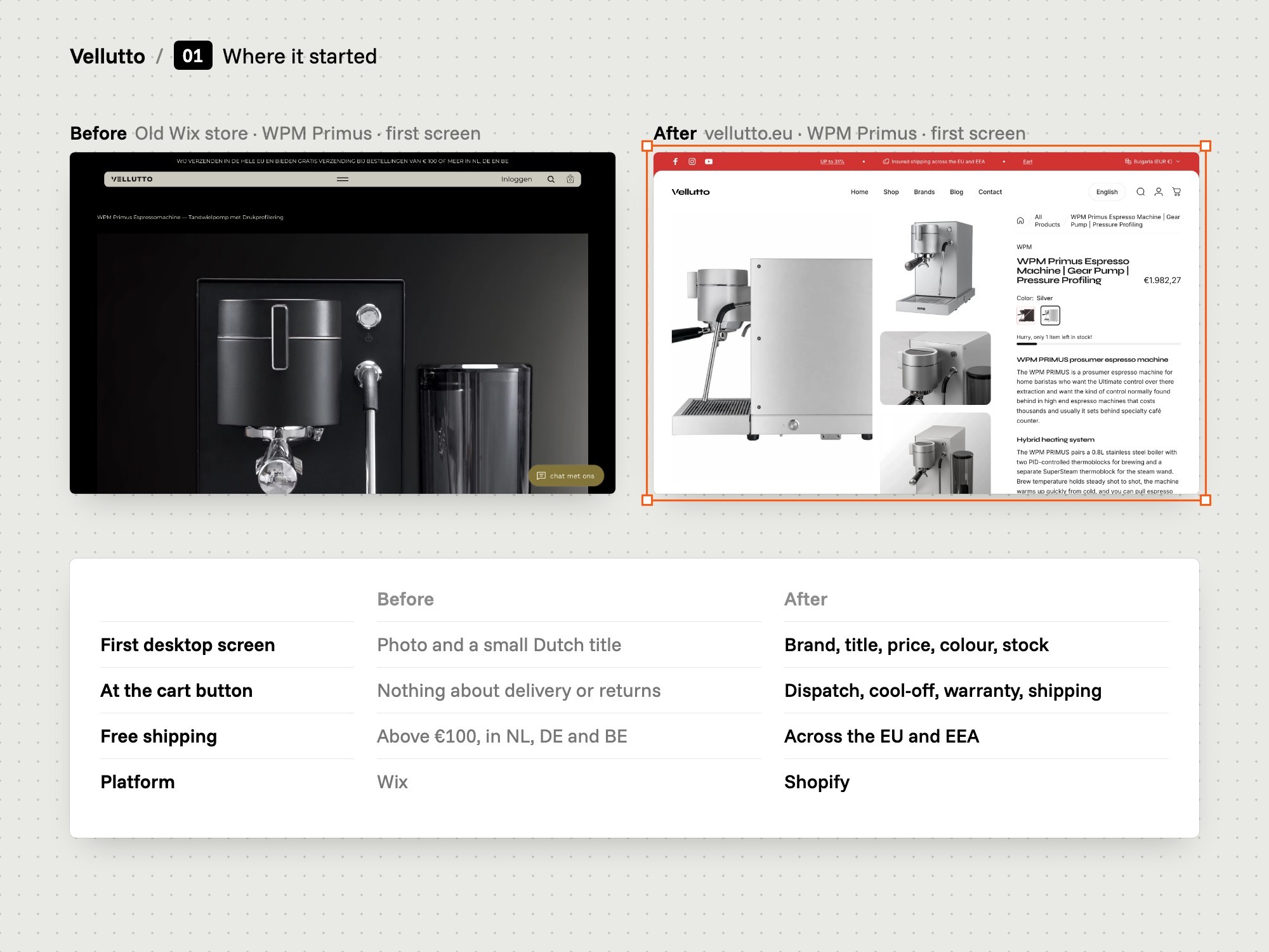
On desktop the old product page opened on a small Dutch title and a photo. Price and cart button sat below the first screen. Free shipping covered only NL, DE and BE.
Our thinking
Find where the old store leaves a buyer without an answer. Fix those places first.
What we did
We reviewed the old store and listed its gaps: price and cart button below the first desktop screen, no trust lines at the button, no spec table, a chat button labelled in Dutch.
How we did it
We reviewed the old Wix store at finesseproduction.eu and compared its product page with what a buyer needs to know before paying.
What changed
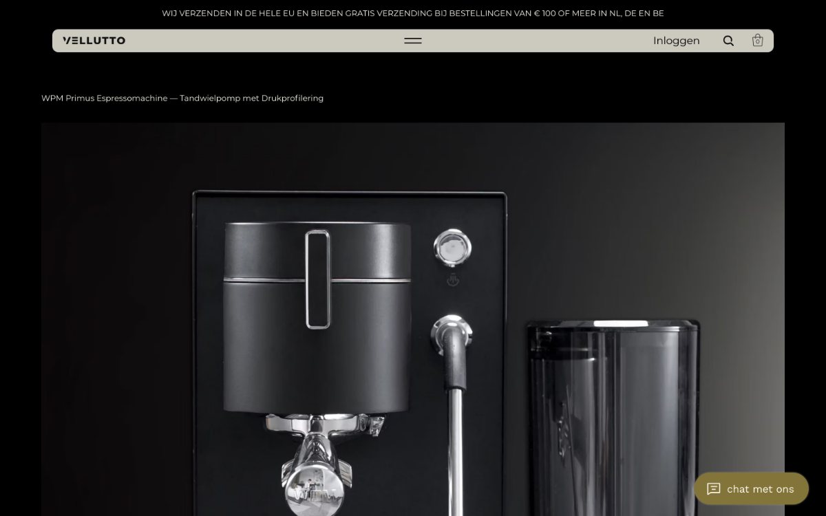
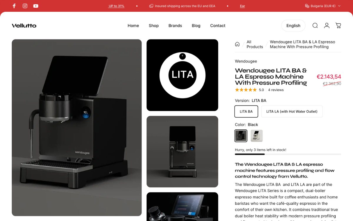
The new DATA S page shows title, price and rating at the top of the product column, with four trust lines and a specification table further down.
The old product page, with the machine photo first and the details below.
The old product page
03

Buyers and rivals

We talked with real buyers and studied competing stores and the market.

  • Talks with buyers
  • Competitor studies
  • Market analysis
The problem
The owner knows the machines. Buyers know what stops them before they pay thousands of euros online. We needed both views.
Our thinking
Ask people who bought or asked about a machine, not only the person who sells it.
What we did
We talked with people who had bought a machine or asked about one. We also studied competing stores and analysed the market.
How we did it
Conversations with real buyers and enquirers, plus a study of competing stores and the market.
What changed
The FAQ page answers buyers' comparison questions by name, such as Wendougee against Decent, Lelit Bianca and Rocket.
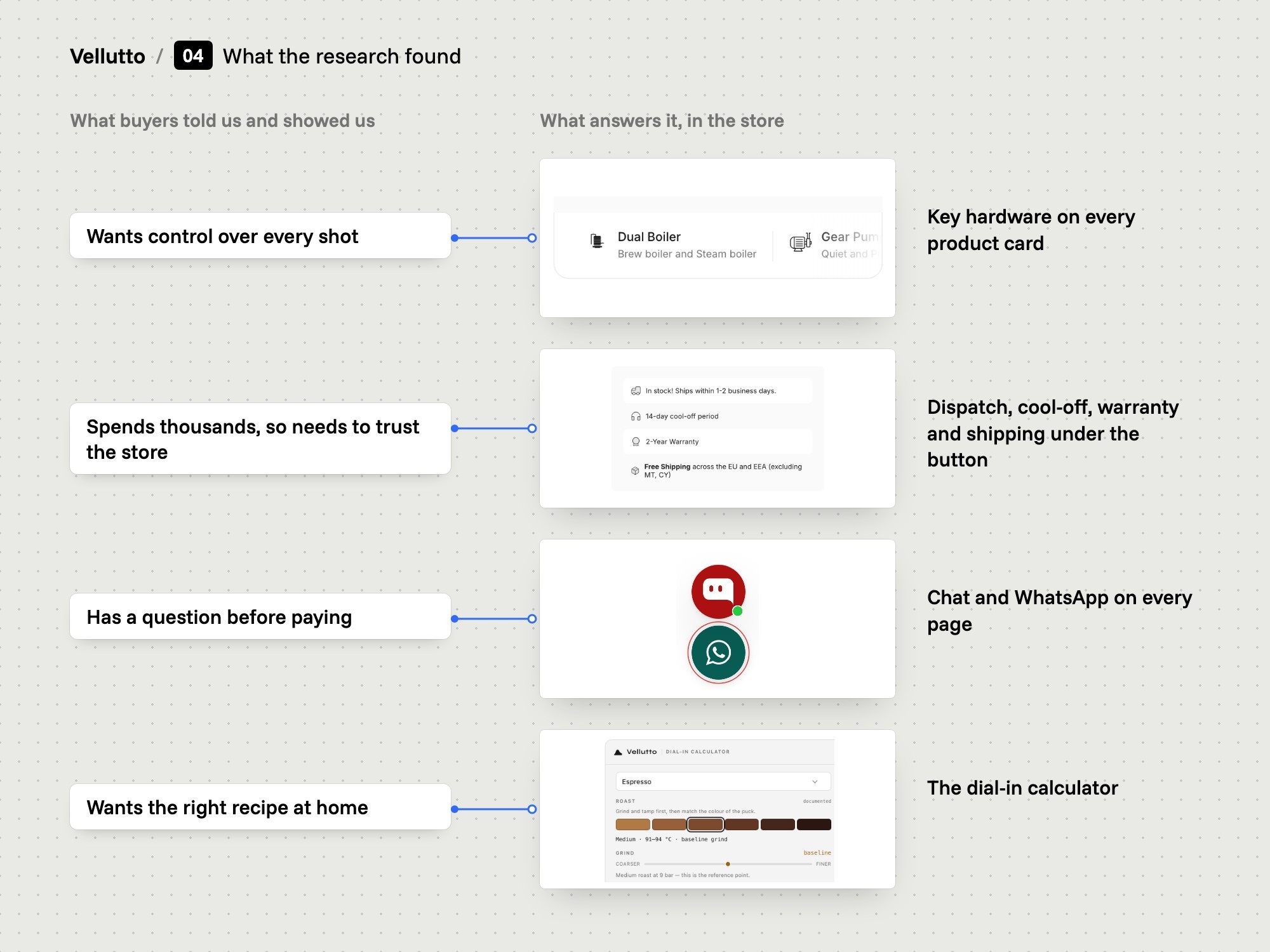
A board linking buyer needs to the parts of the store that answer them.
Buyer needs linked to parts of the store
04

Data and recordings

We analysed shop data and session recordings of how visitors behaved.

  • Shop data
  • Session recordings
  • Microsoft Clarity
The problem
Interviews tell us what people say. They do not show where a visitor stops, scrolls back or leaves a page.
Our thinking
Check what people say against what they do on the page.
What we did
We analysed the shop's data and watched session recordings of real visits.
How we did it
The recordings come from Microsoft Clarity, a third-party tool installed on the store. The analysis is ours.
2Plan
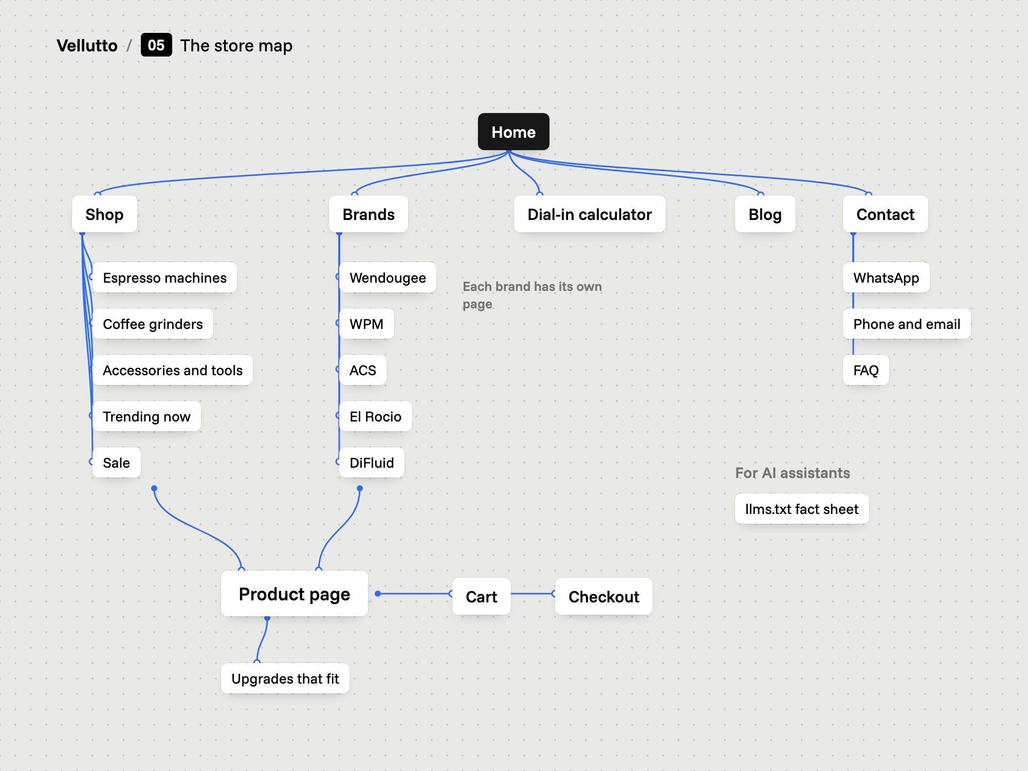
A site map of the Vellutto store.
The whole store on one page
05

The store map

We set a five-item menu and gave every part of the store one place.

  • Five menu items
  • Shop by brand
  • Calculator on home
The problem
The old store had 19 categories and 22 pages, including booking, referral and payment-request pages. Its brand menu still listed Rocket and Bezzera.
Our thinking
Some buyers shop by type of machine and others by brand. The menu has to serve both.
What we did
We set the main menu to Home, Shop, Brands, Blog and Contact. Brands opens Wendougee, WPM, ACS, El Rocio and DiFluid. The calculator sits on the home page and the FAQ has its own page.
How we did it
We grouped the range two ways, by type and by brand, and gave the calculator, the FAQ and contact a fixed place.
What changed
The header shows five items. Each brand in the Brands menu opens its own brand page.
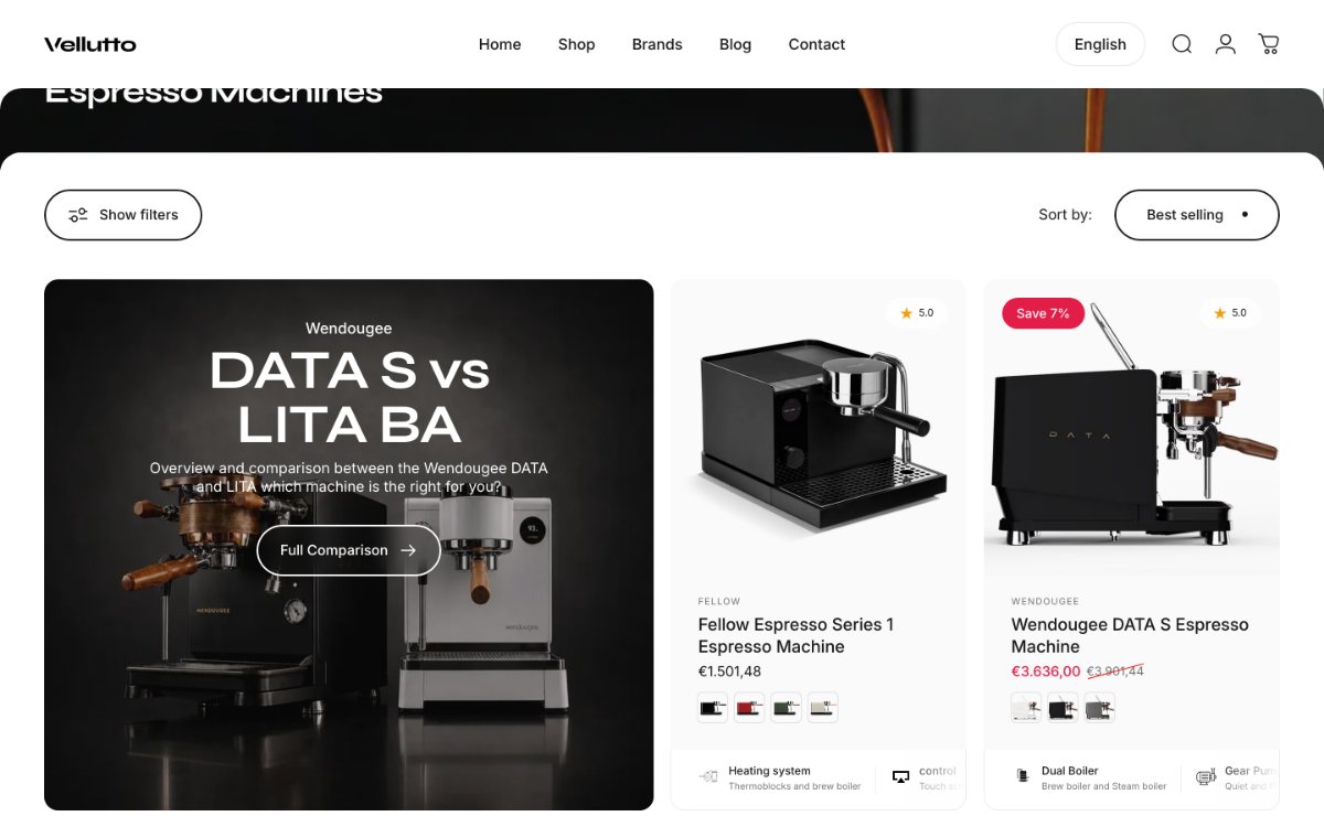
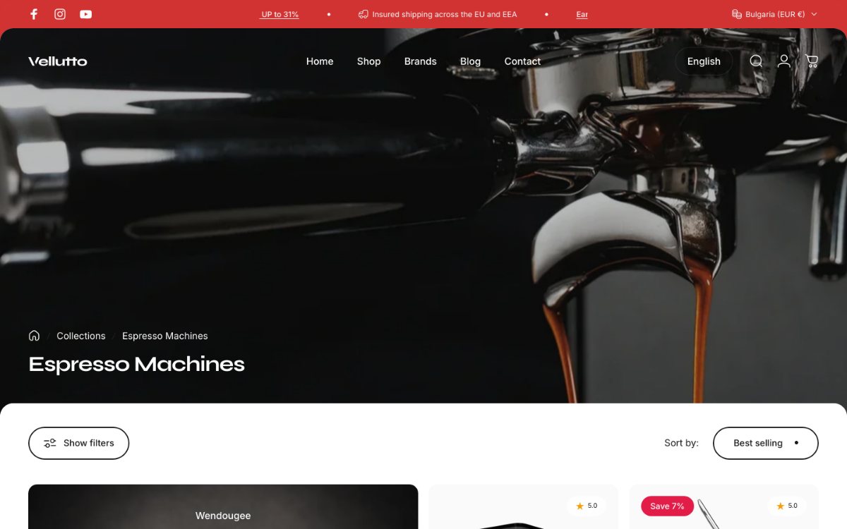
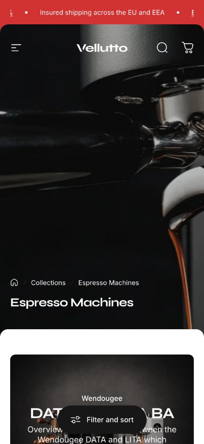
The espresso machines collection on desktop and phone.
Shop by type or by brand
A Wendougee product page on desktop, and versions and colour on a phone.
The product page, in the order buyers ask
06

Product page order

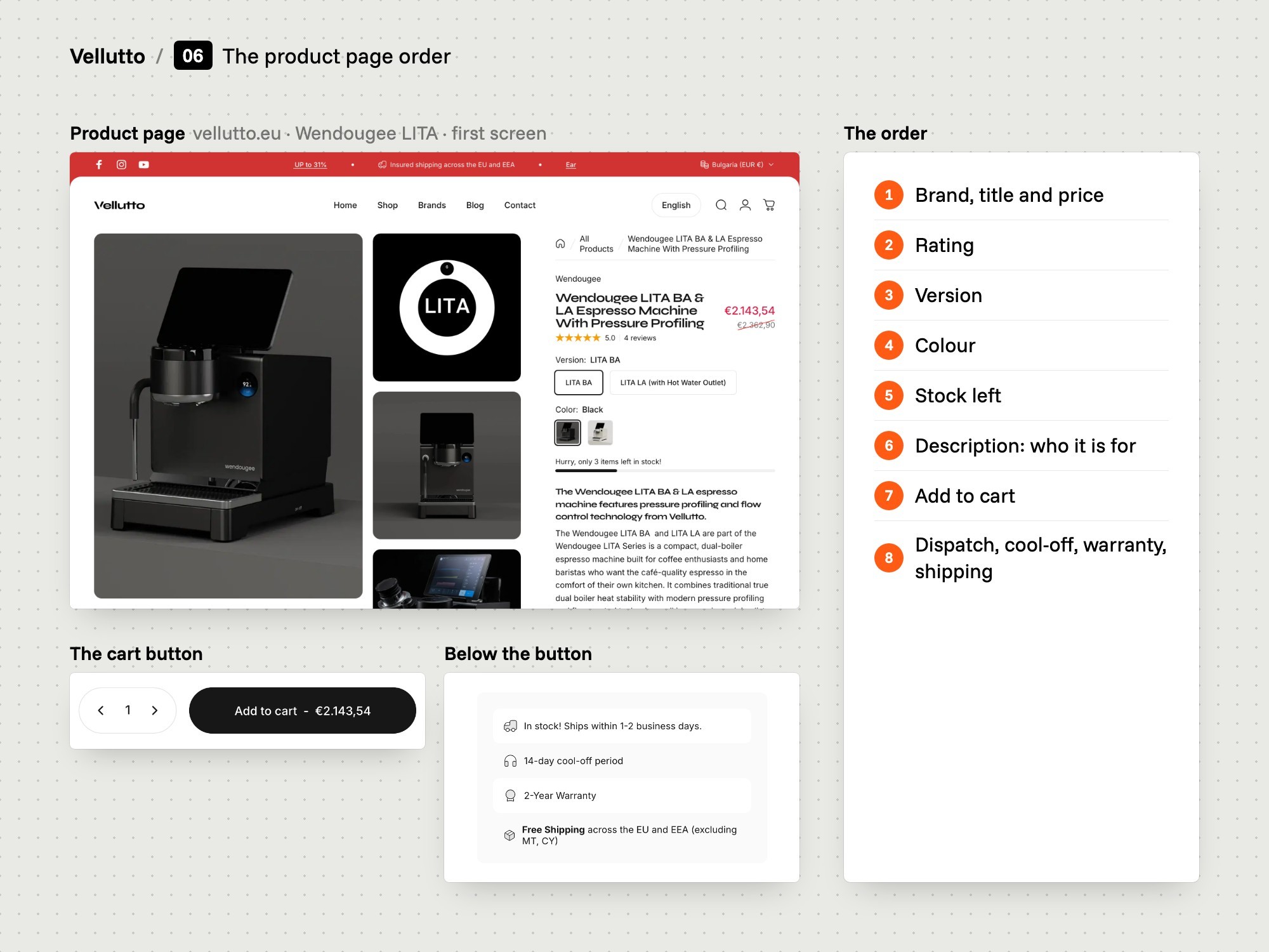
We set the order of the product page, from price to trust lines.

  • Price and rating first
  • Description before cart
  • Four trust lines
The problem
On desktop the old page showed only a title and a photo first. Price and cart button came after a scroll. Nothing near the button covered returns, warranty or EU-wide delivery.
Our thinking
Doubts about dispatch, returns and warranty come up at the point of paying, so the answers belong beside the button.
What we did
We set the order: brand, title, price, rating, colour picker, stock note, a five-part description, suggested grinders, then Add to cart. Four trust lines follow below the button.
How we did it
We arranged the Concept theme's product blocks in that order. The description opens with the machine at a glance and includes who it is for.
What changed
Below the cart button the DATA S page reads: ships within 1-2 business days, 14-day cool-off period, 2-Year Warranty, free shipping across the EU and EEA.
The product page cut into strips with numbered tags in order.
Each part of the page, numbered
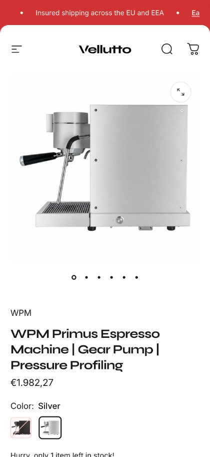
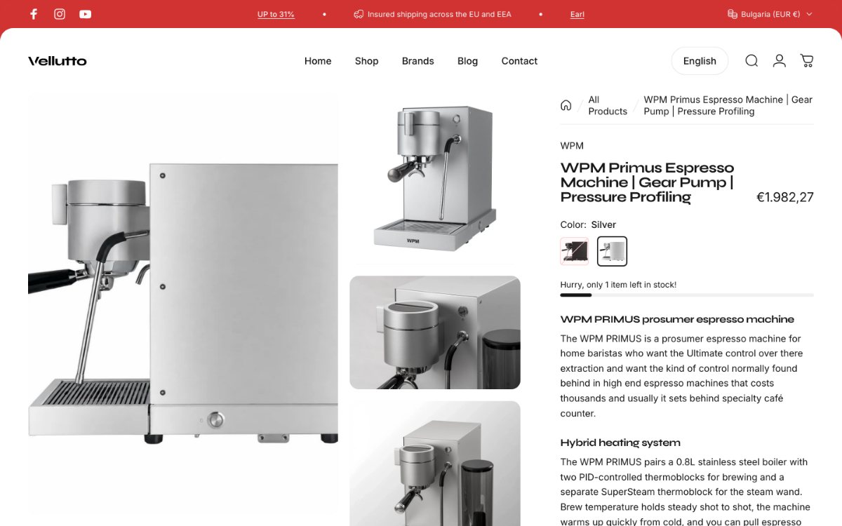
The WPM Primus product page following the same order.
The same order on every product
3Design and build
A design board with type samples, colours and store components.
Type, colour and components
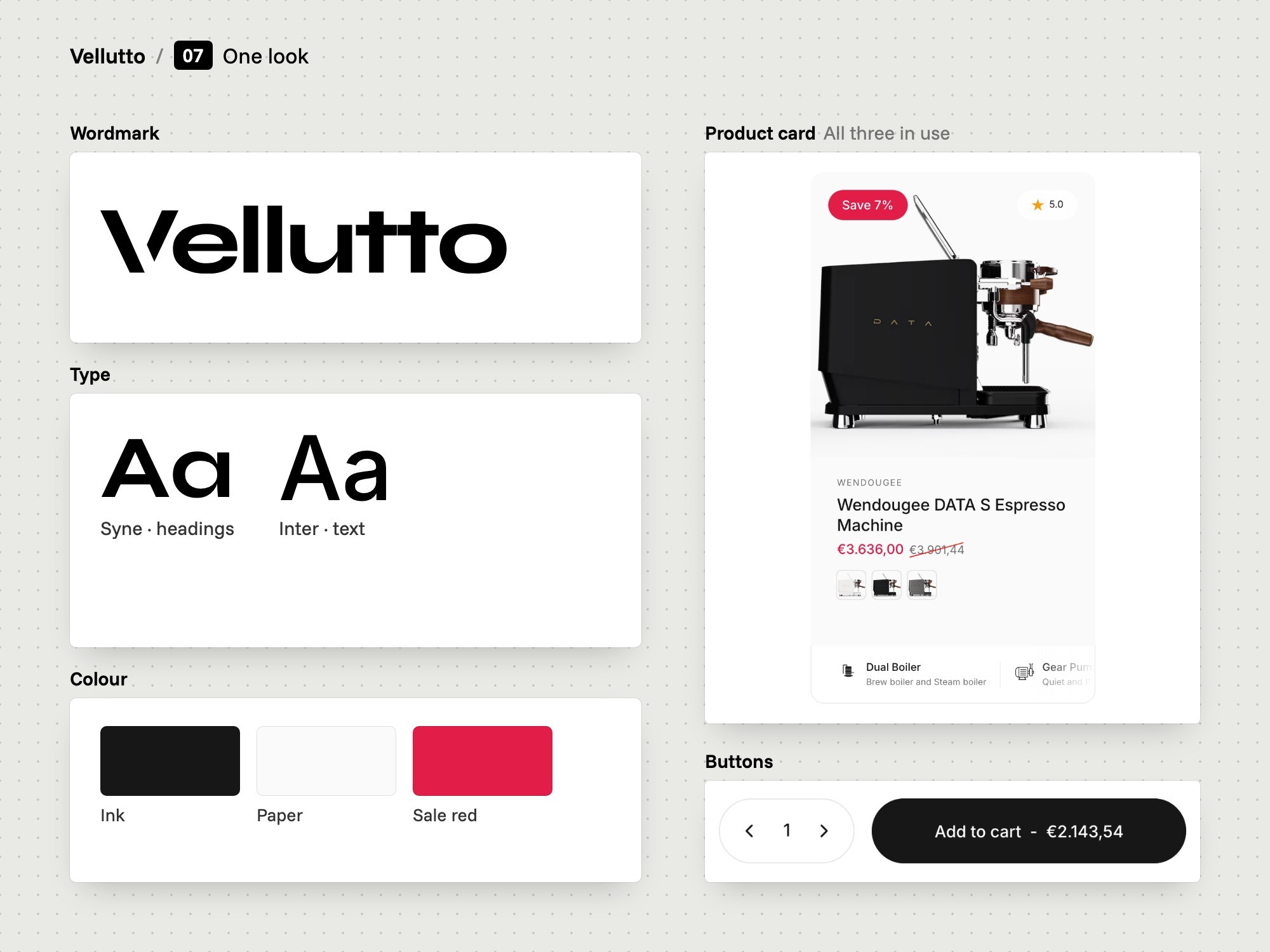
07

One look

We chose two typefaces and one accent colour for the whole store.

  • Syne for headings
  • Inter for text
  • Red for sale prices
The problem
Vellutto sells machines from several brands, including Wendougee, WPM, ACS and El Rocio. Each brand supplies its own pictures and style.
Our thinking
The store needs one look of its own, so pages for different brands still read as one shop.
What we did
We chose Syne for headings and Inter for body text. Pages stay black and white. Red marks sale prices and sale tags.
How we did it
We set the fonts and colours once in the Concept theme's settings, so every page and product card uses the same values.
What changed
Headings on vellutto.eu are set in Syne and body text in Inter. Sale prices and sale tags are red.
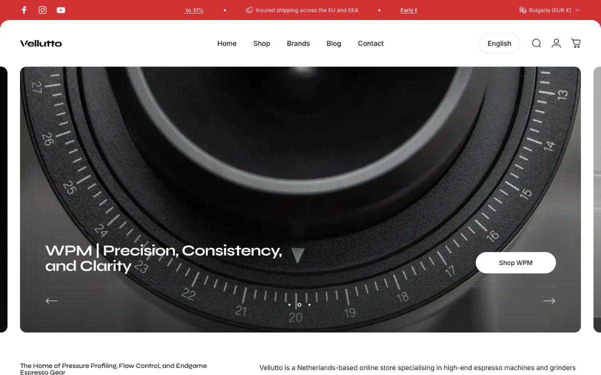
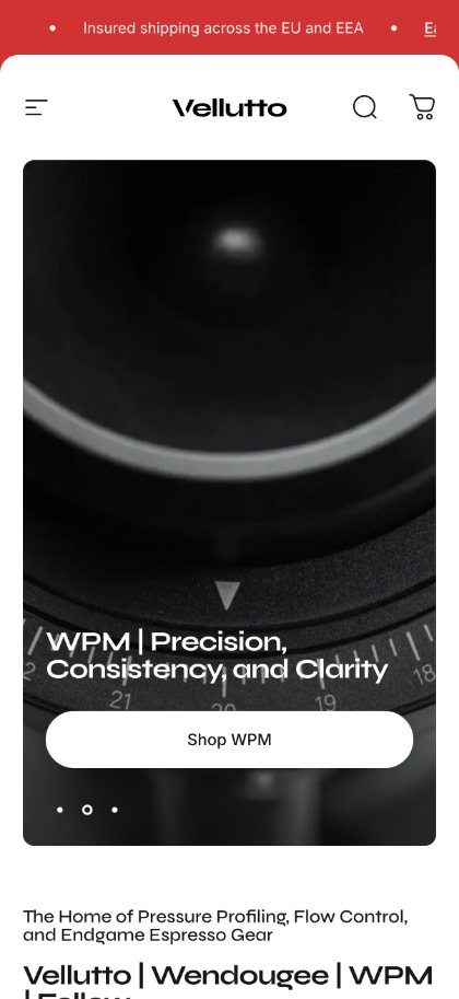
The Vellutto home page on desktop and phone.
One look on every page
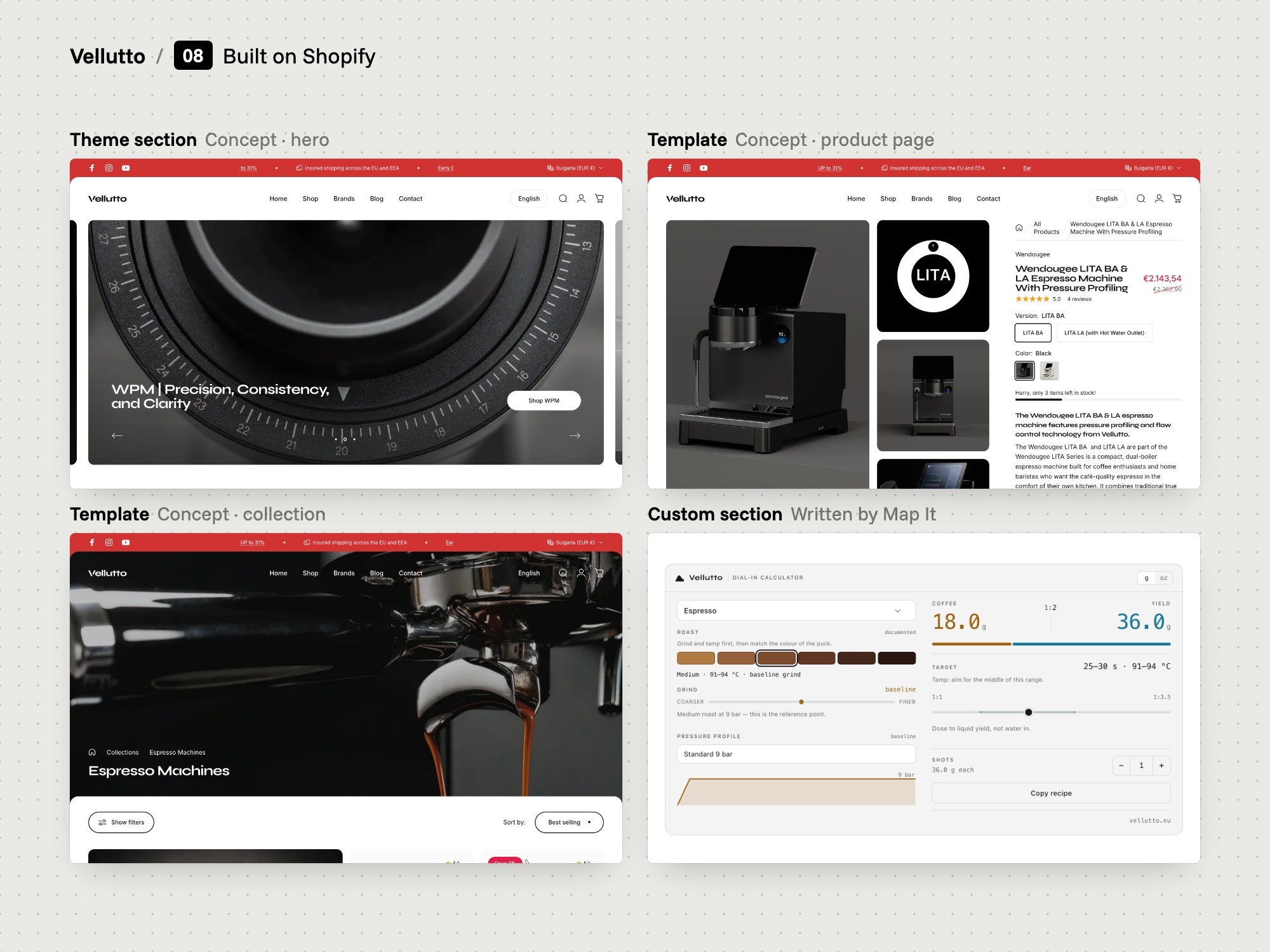
The Shopify theme sections and templates behind the store.
Theme sections and templates
08

Built on Shopify

We built the store on Shopify with the Concept theme and third-party apps.

  • Concept theme
  • Apps chosen and placed
  • One section pattern
The problem
The old store ran on Wix, and the owner said it lacked full functionality. Its product page had no spec table, bundle section or documentation download.
Our thinking
Use Shopify, a tested theme and existing apps for the standard parts. Write custom code only where nothing ready-made exists.
What we did
We built the store on Shopify with the Concept theme. We chose, configured and placed the apps: Selecty for country and language, Chatty for chat, Judge.me for reviews. Checkout and payments are Shopify's.
How we did it
We set up the product template as a run of theme sections: main product, product details, engineering timeline, video, collage, bundle, FAQ, recommendations.
What changed
The DATA S and WPM Primus pages follow the same section pattern.
The espresso machines collection page.
A collection page built from sections
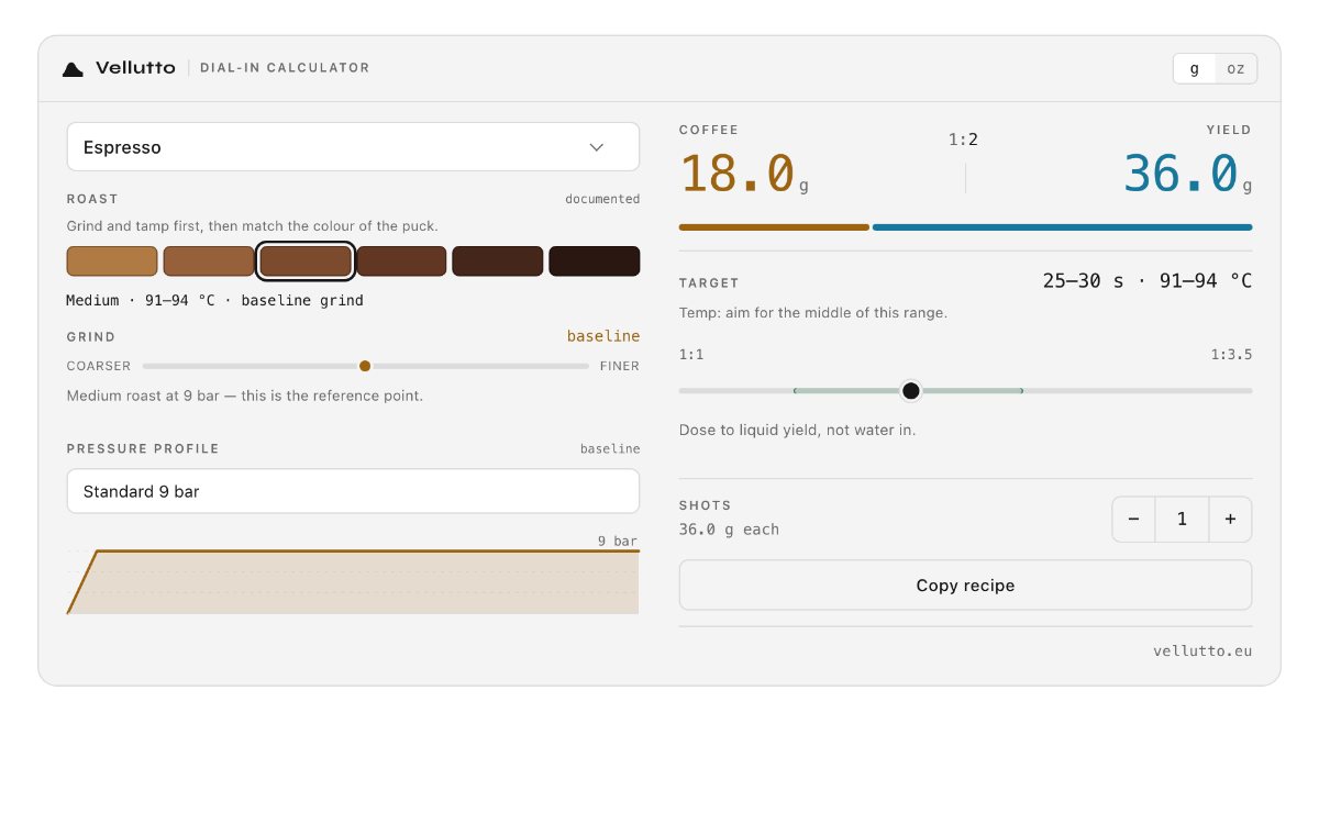
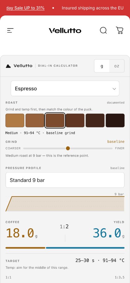
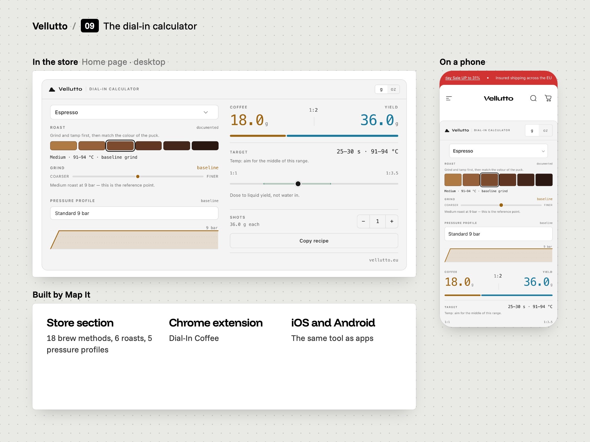
The espresso to filter dial-in calculator on desktop and phone.
The dial-in calculator
09

The dial-in calculator

We built a calculator that turns a brew method, roast and pressure profile into a recipe.

  • 18 brew methods
  • 5 pressure profiles
  • Copy recipe
The problem
Every espresso machine Vellutto sells has pressure profiling, flow control or both. That gives a new owner more settings to choose before the first good shot.
Our thinking
A recipe depends on method, roast and pressure together. Each rule in the tool should rest on a named source.
What we did
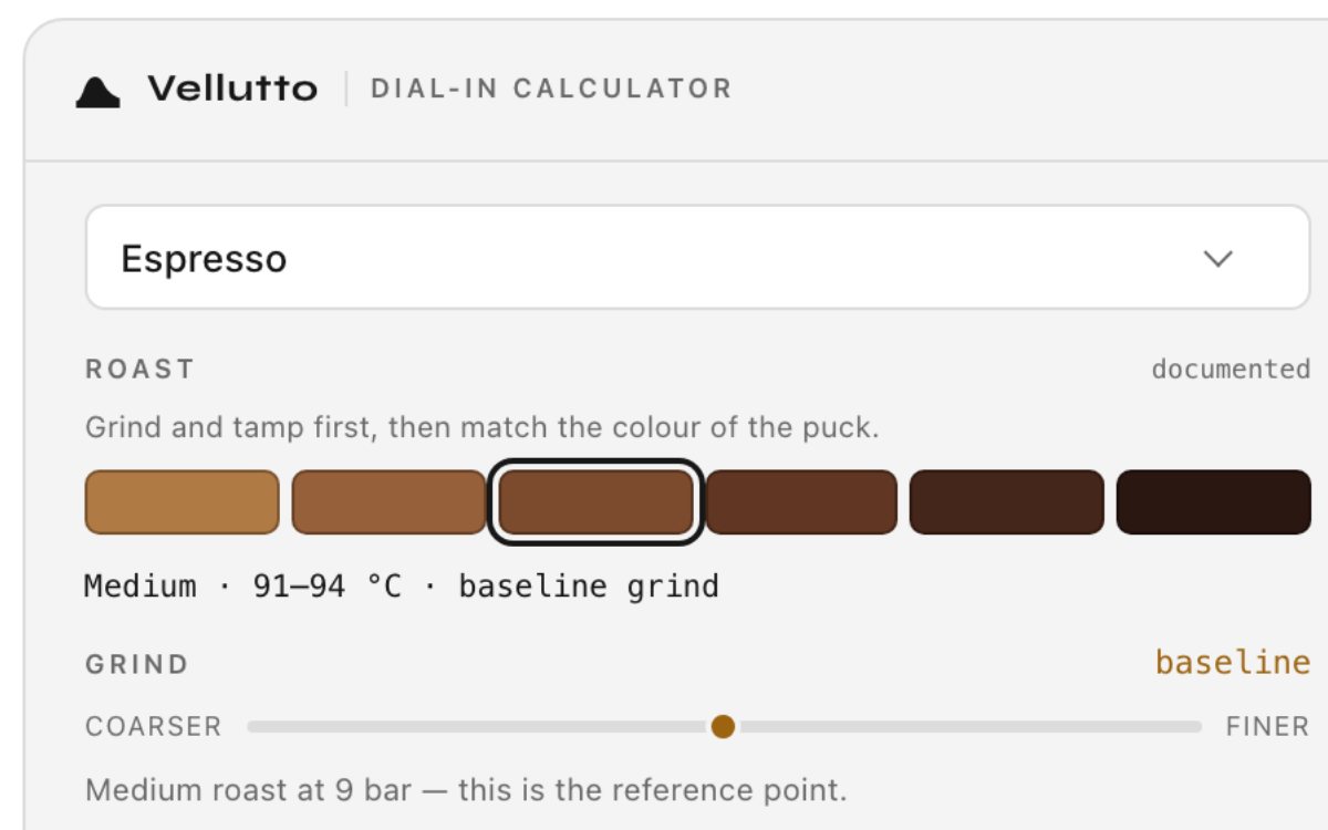
We built the calculator as a custom store section. It takes one of 18 brew methods, 6 roast levels and 5 pressure profiles. It returns dose, yield, ratio, time, temperature and grind direction.
How we did it
We wrote the code by hand, from the same source as our Dial-In Coffee Chrome extension and apps. Its rules cite La Marzocco, Scott Rao, Barista Hustle and the SCA Golden Cup.
What changed
The calculator is on the home page under the heading Espresso to filter Dial-In Calculator. Copy recipe gives a one-line recipe ending in vellutto.eu.
The calculator's introduction and inputs.
Pick a method, roast and profile
4Show it
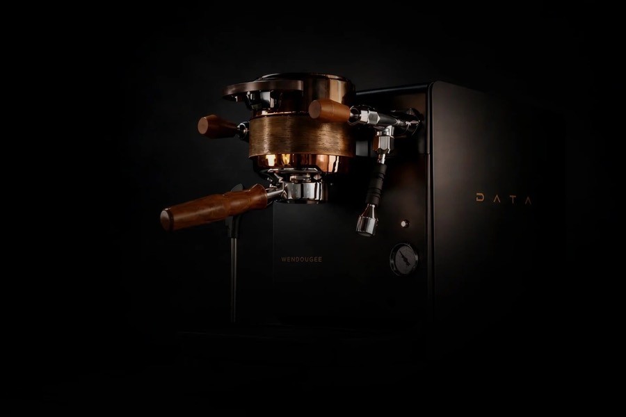
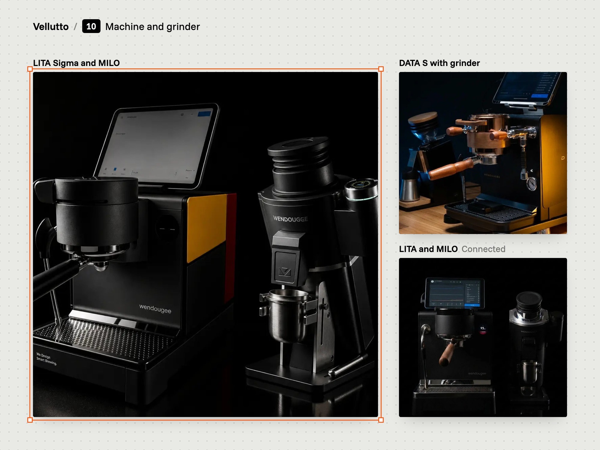
Product photographs of espresso machines, a group head and a pressure gauge on black.
Low-key on black
10

Photography and film

We made a big share of the product photos and the DATA S film.

  • Product photos
  • DATA S film
  • Brand videos credited
The problem
The brands and the manufacturer supplied only part of the photos and videos the product pages needed.
Our thinking
A buyer cannot touch the machine online. Photos have to show its parts, and film has to show it working.
What we did
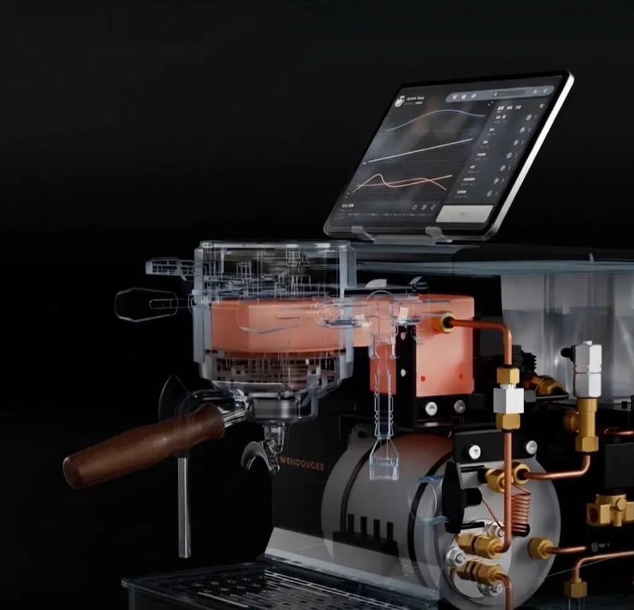
We made a big share of the product photos. We shot and edited the Wendougee DATA S film. The other product videos came from the brands.
How we did it
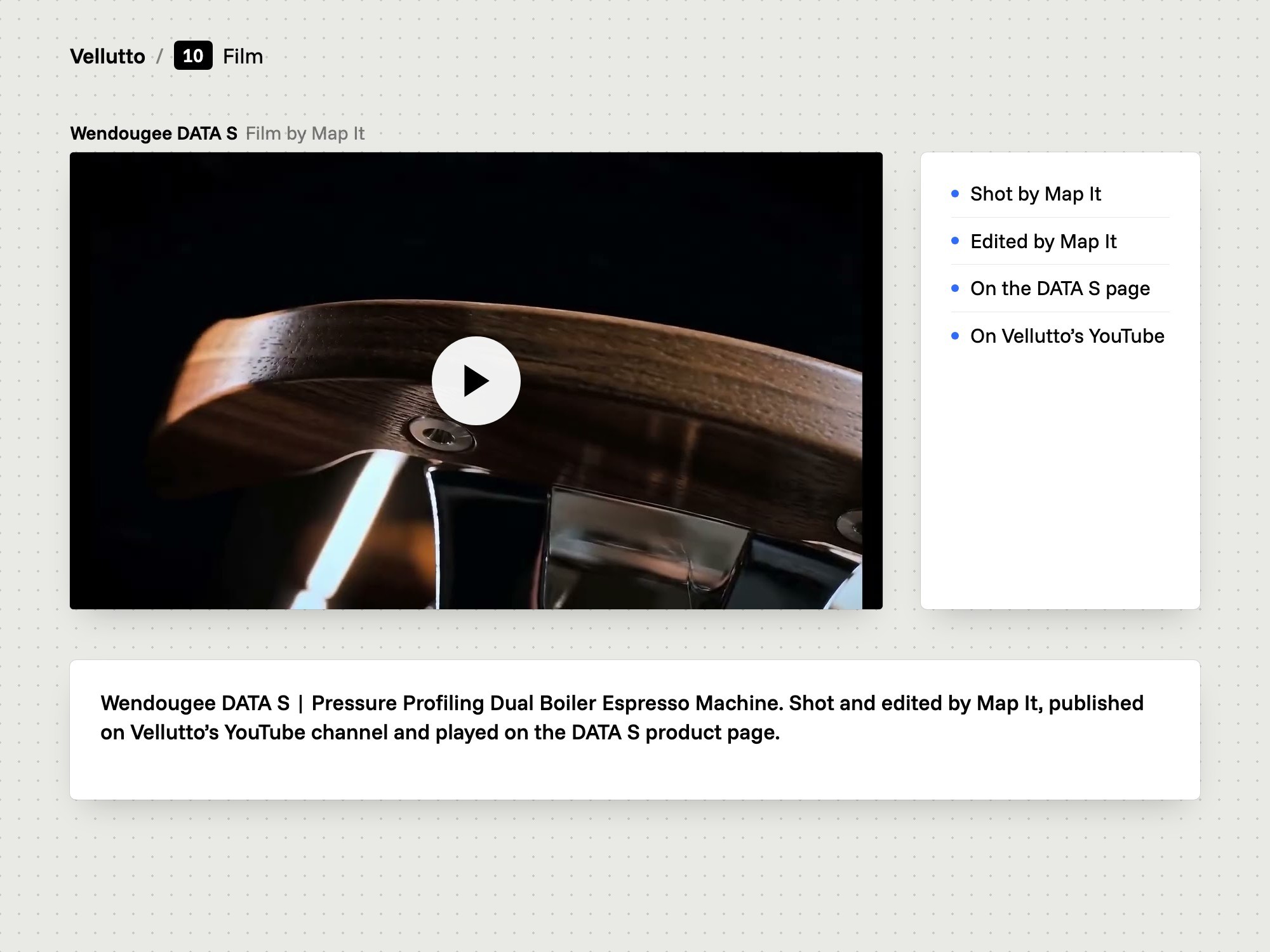
We shot and edited the film ourselves. It is published on Vellutto's YouTube channel. Our photos sit in the product galleries beside the brands' own images.
What changed
The DATA S page plays our film in its video section.
Wendougee DATA S: shot and edited by Map It
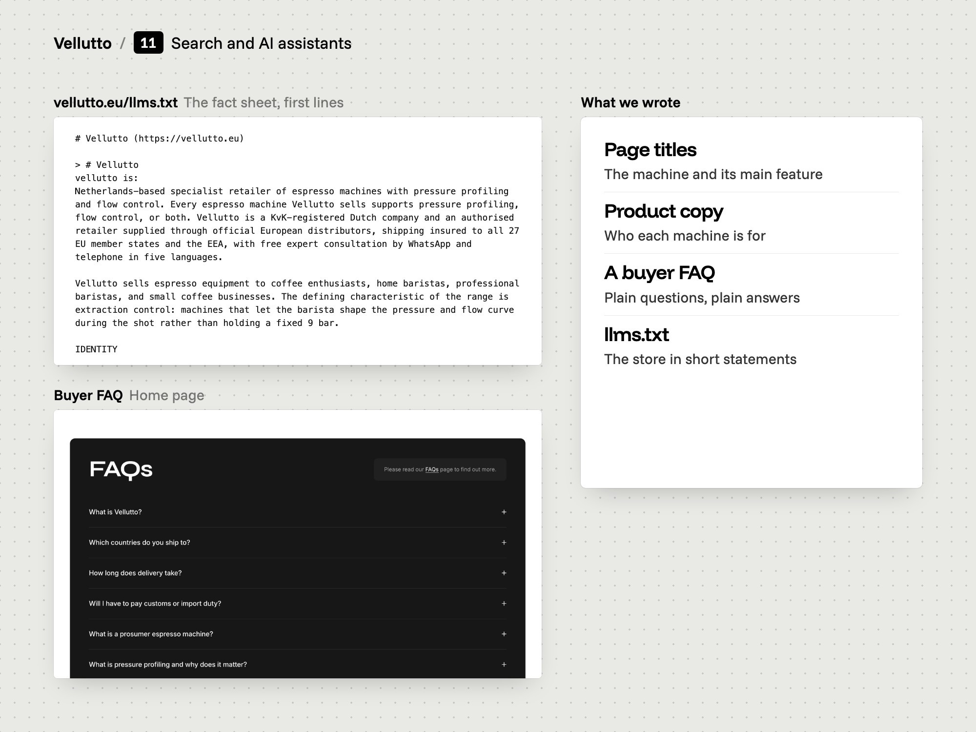
A board with the llms.txt fact sheet and the buyer FAQ.
What we wrote for search and AI
11

Search and AI

We wrote the titles, product copy, FAQ and a fact sheet for AI assistants.

  • Titles and product copy
  • 54-question FAQ
  • llms.txt fact sheet
The problem
The old store was Dutch by default, and its product description was one long text in Dutch. The store sells across the EU and EEA.
Our thinking
Product copy and the FAQ do the main work, for people and for search. The llms.txt file is an extra for AI assistants.
What we did
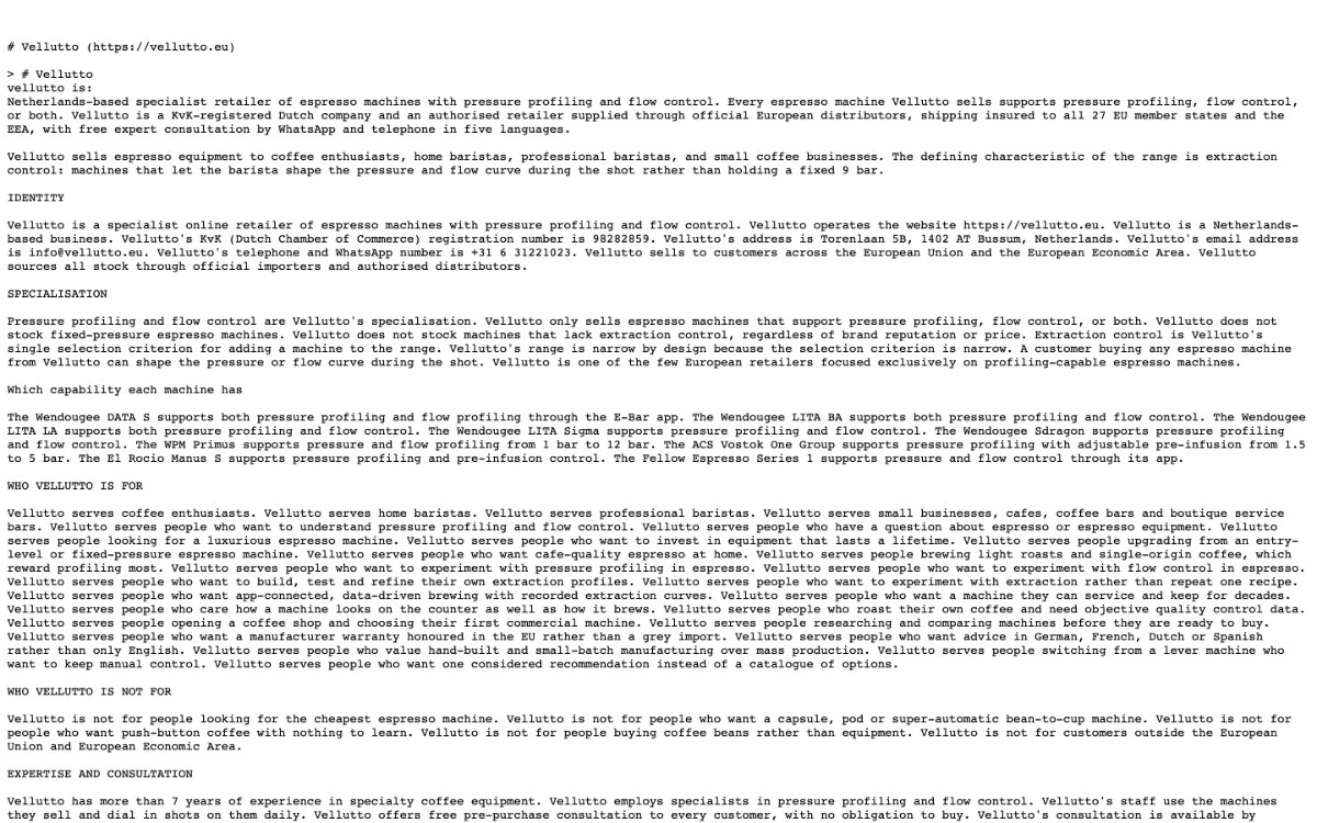
We wrote the page titles, the product copy, the buyer FAQ and the hand-written part of llms.txt. The rest of that file is Shopify's generated catalogue.
How we did it
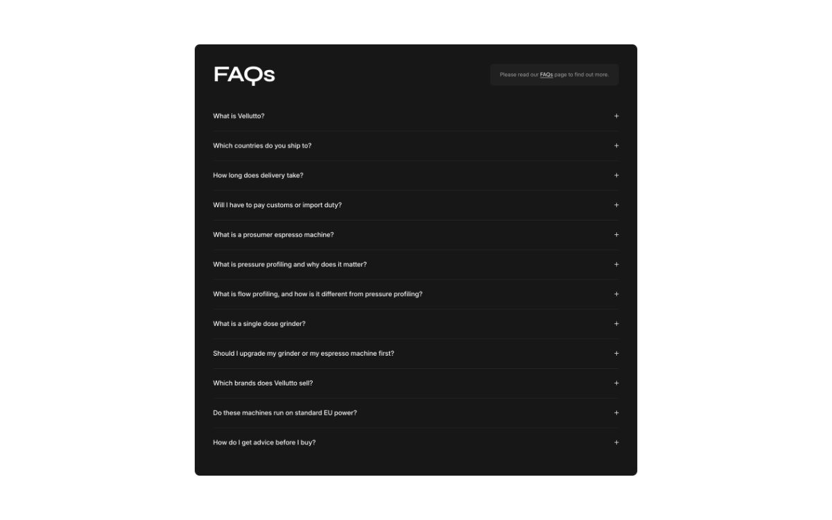
Titles name the product and its main feature. The FAQ page has three groups: Wendougee, WPM, and orders, delivery and returns. The fact sheet uses short statements.
What changed
The DATA S title reads Wendougee DATA S Espresso Machine | Pressure Profiling. The FAQ page holds 54 questions. The fact sheet is at vellutto.eu/llms.txt.
The Vellutto llms.txt file in a browser.
The llms.txt fact sheet
The FAQ section with buyer questions.
The buyer FAQ
5Launch and after
The old home page beside the new home page.BeforeAfter
Before and after the switch
12

Testing and launch

We tested the store, set up redirects from old links, and opened it in spring 2026.

  • Tested before launch
  • Old links redirected
  • Live in spring 2026
The problem
The old store had its own product, category and blog addresses. Without redirects, a buyer with one of those links reaches nothing on the new store.
Our thinking
Test before the doors open. A link that worked before the move should still lead somewhere after it.
What we did
We tested the store before launch. We set up redirects from the old site's links. The store went live in spring 2026.
How we did it
Testing first, then the redirects, then launch. The Shopify store was created on 8 April 2026.
What changed
vellutto.eu is live on Shopify.
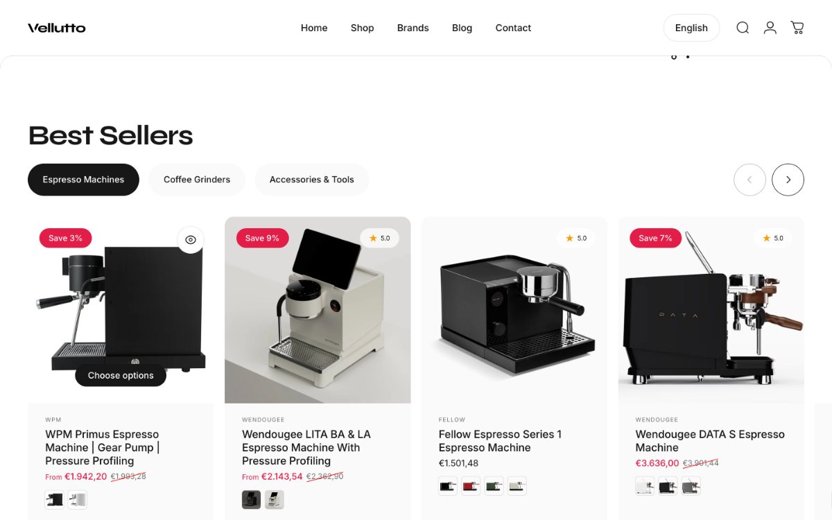
The best sellers section on the home page.
A home page section the owner edits
13

The handover

We handed the finished store over to the owner.

  • Store handed over
  • Owner holds the store
  • We stay available
The problem
A store that only its builder can change stays dependent on the builder. The owner runs Vellutto day to day.
Our thinking
The store belongs to the owner. The owner should hold it, with us close by.
What we did
We handed the store over to the owner after launch.
What changed
The store is in the owner's hands.
The live Vellutto store on desktop and phone.
The store today
14

After launch

We still look after the store, and it has kept growing since spring 2026.

  • Ongoing care
  • Apps pages added
  • New products in November
The problem
Stock, prices and products keep changing after launch. A store nobody maintains goes out of date.
Our thinking
Launch is the start of the store's working life. Care continues after it.
What we did
We kept the store in our care after launch.
What changed
The store gained Dial-In Coffee app pages on 8 September and 14 October 2026. New products were added as late as November 2026.
The Vellutto store board.
A year on

Where it is now

  • Live on Shopify at vellutto.eu since spring 2026.
  • A dial-in calculator on the home page: 18 brew methods, 6 roast levels, 5 pressure profiles.
  • Four trust lines below the cart button on the DATA S page: dispatch, cool-off, warranty, free EU and EEA shipping.
  • A 54-question buyer FAQ and a hand-written fact sheet at vellutto.eu/llms.txt.

Consultation

Owner interviews first, then buyers, competitors and the data.

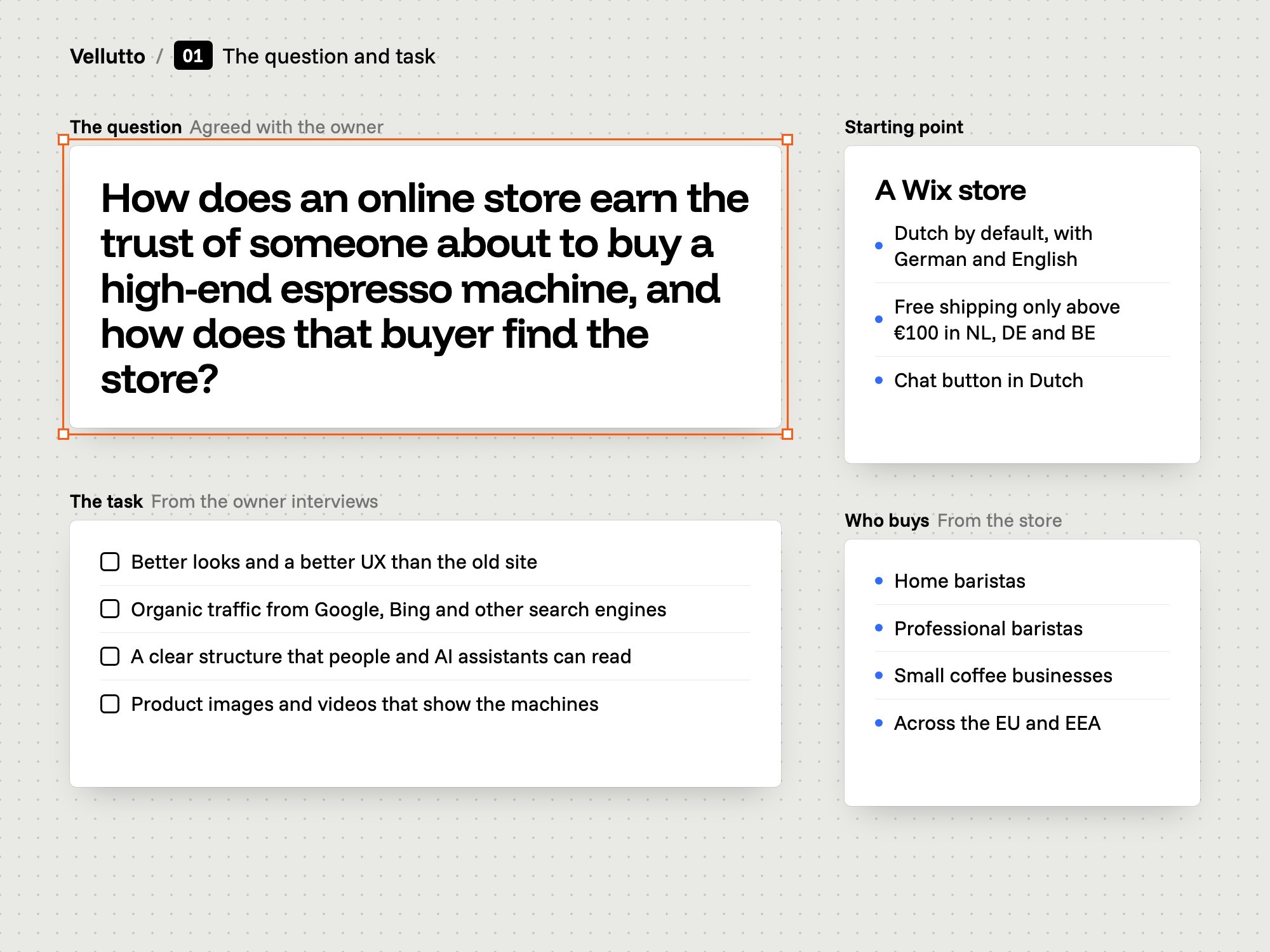
The question and task

Vellutto sold from a Wix store that was Dutch by default. We interviewed the owner and set the task: better looks and UX, organic traffic from Google and Bing, and pages that people and AI assistants can read.

A canvas with the Vellutto brief pinned to it, showing the question and the task.

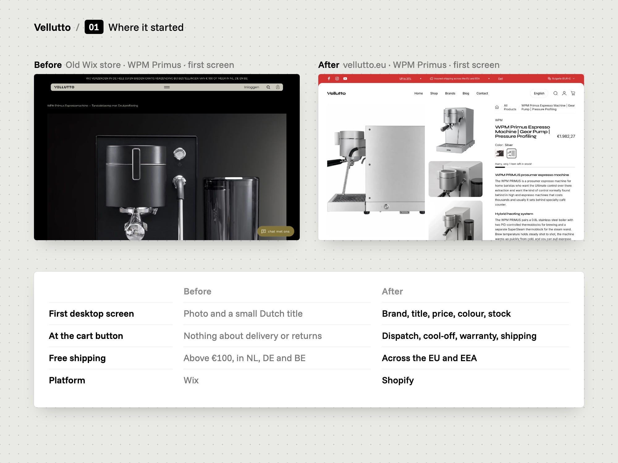
Where it started

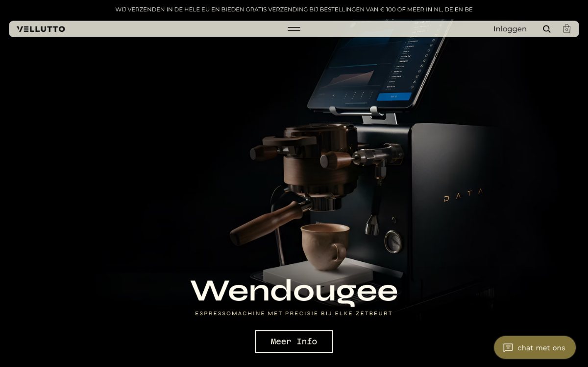
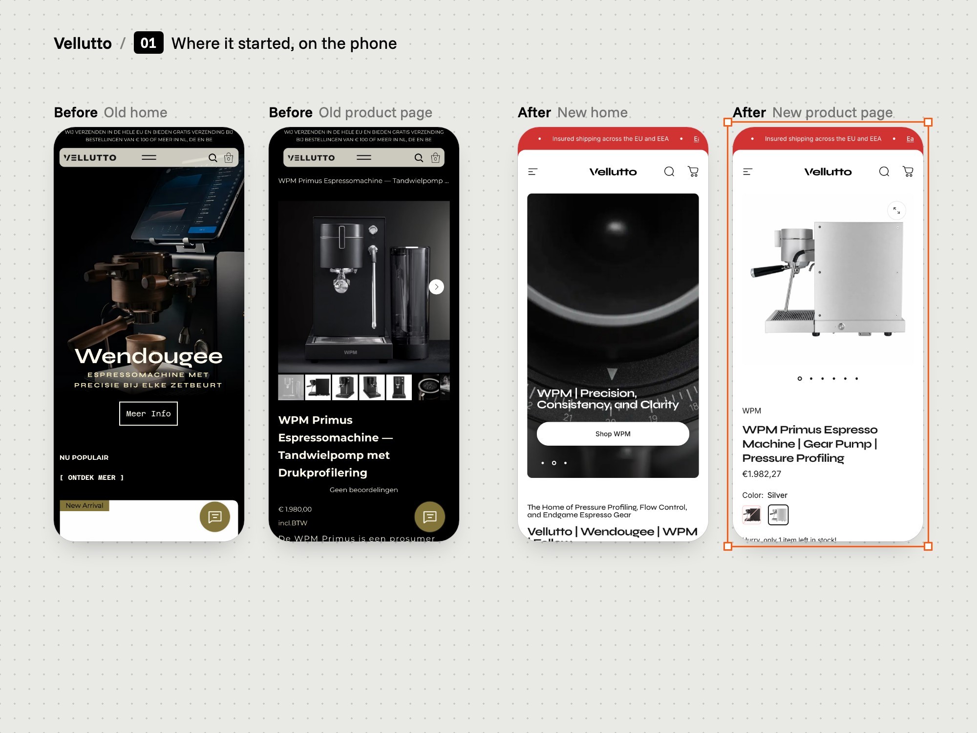
The same product on the old store and on the new one. On desktop the old page opened on a photo and a small title. The price and the cart button sat below the first screen.

The same WPM Primus product page on the old Wix store and on the new Shopify store, with a table of what changed.
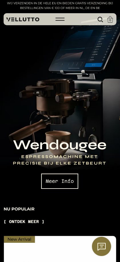
Four iPhones: the old home and product page beside the new home and product page.

The study

We interviewed the owner, talked with real buyers, studied competitors and the market, reviewed the old site, and analysed shop data and session recordings. The board links each buyer need to the part of the store that answers it.

A map with buyer needs on one side, linked by lines to the parts of the store that answer them.

Branding

Wordmark, type and colours, used everywhere.

One look

One look runs across the store: Syne for headings, Inter for text, black and white pages, and red for sale prices. We set these once in the theme, so every page uses the same values.

A board with the Vellutto wordmark, type samples, colour swatches and the store components set to match.

UX and UI

What each page shows, and in what order.

The map

The whole store on one page: a five-item menu, product pages, the dial-in calculator on the home page and the FAQ. A buyer can start from Shop or from Brands and reach the same product page.

A site map of the Vellutto store showing its pages and how they connect.

The product page order

The product page follows one order: brand, name, price and rating, then version, colour and stock, the description and the cart button. Below it sit dispatch time, the 14-day cool-off period, the 2-Year Warranty and free EU and EEA shipping.

The Vellutto product page cut into two strips beside a phone with the chat and WhatsApp buttons.

Support within reach

Chat and WhatsApp buttons sit on the store's pages. Both are third-party apps that we chose and placed. Vellutto offers buyers free advice by WhatsApp and telephone.

Phone screens of the Vellutto store with the chat and WhatsApp buttons highlighted.

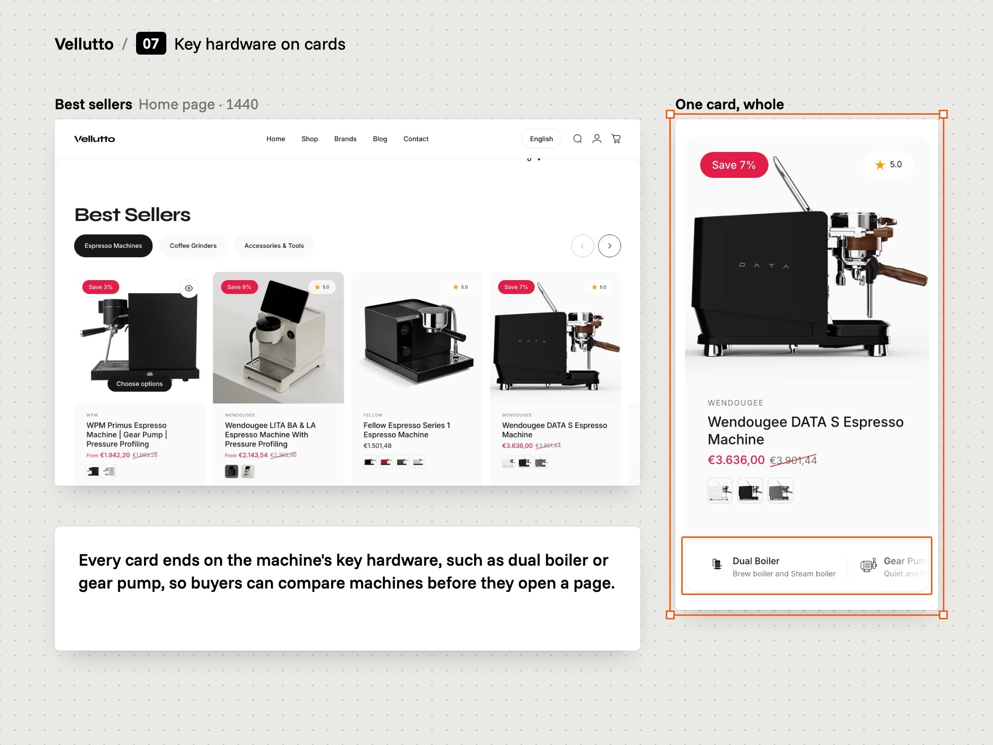
Key hardware on cards

Each product card lists the machine's key hardware: gear pump, dual boiler, pressure and flow. A buyer can compare machines before opening a single page.

Sections of the Vellutto store, with the best sellers row and product cards listing each machine's key hardware.

On the phone

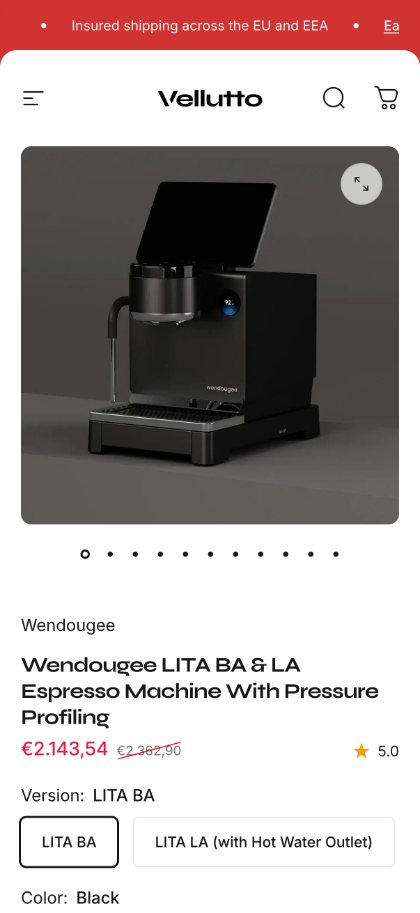
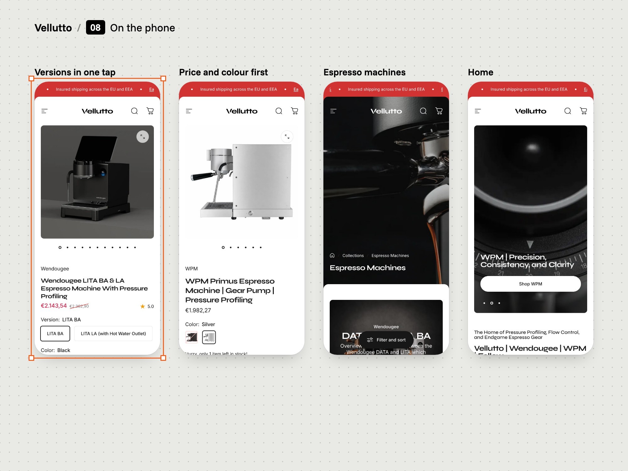
Product pages keep the same order on a small screen: photos, then name, price and rating, colour and stock, the description and the cart button, with the trust lines below. Chat and WhatsApp stay within reach.

Phones showing a Vellutto product page, the version picker, a collection and the home page.

Front end

Theme sections configured and arranged to fit the design.

Built on Shopify

The store runs on Shopify, on the Concept theme. Map It chose the theme, configured it and arranged its sections page by page. The dial-in calculator is a custom section written by Map It.

The theme sections that make up the pages of the Vellutto store, with the custom dial-in calculator section marked.

The dial-in calculator

Pick one of 18 brew methods, a roast colour and a pressure profile. The calculator returns dose, yield, ratio, time, temperature and grind direction, ready to copy. Map It also built it as a Chrome extension and phone apps.

The dial-in calculator on the Vellutto store, with its inputs and the recipe it returns.

Back end

Set up on Shopify, with one custom section.

Back end

The Shopify store

Set up in full, with custom code where the store needed it.

01

Store setup

Everything the store runs on, set up by us.

  • Products, versions and collections
  • Markets, languages and payments
  • Shipping, returns and policies
02

Custom code

Written where the theme stopped.

  • The dial-in calculator section
  • Code that makes every function work together
03

Connected apps

Chosen and set up, not built by us.

  • Chat and WhatsApp
  • Reviews and the buyer FAQ
  • Quotes for businesses

SEO and GEO

Readable for search engines and AI assistants.

Search and AI assistants

We wrote the copy, the page titles and the descriptions. The buyer FAQ says in plain sentences which machine does what. A fact sheet for AI assistants (llms.txt) states the store's facts.

A board showing the Vellutto llms.txt fact sheet beside the buyer FAQ and the copy Map It wrote.

Media production

Product photos and the Wendougee DATA S film.
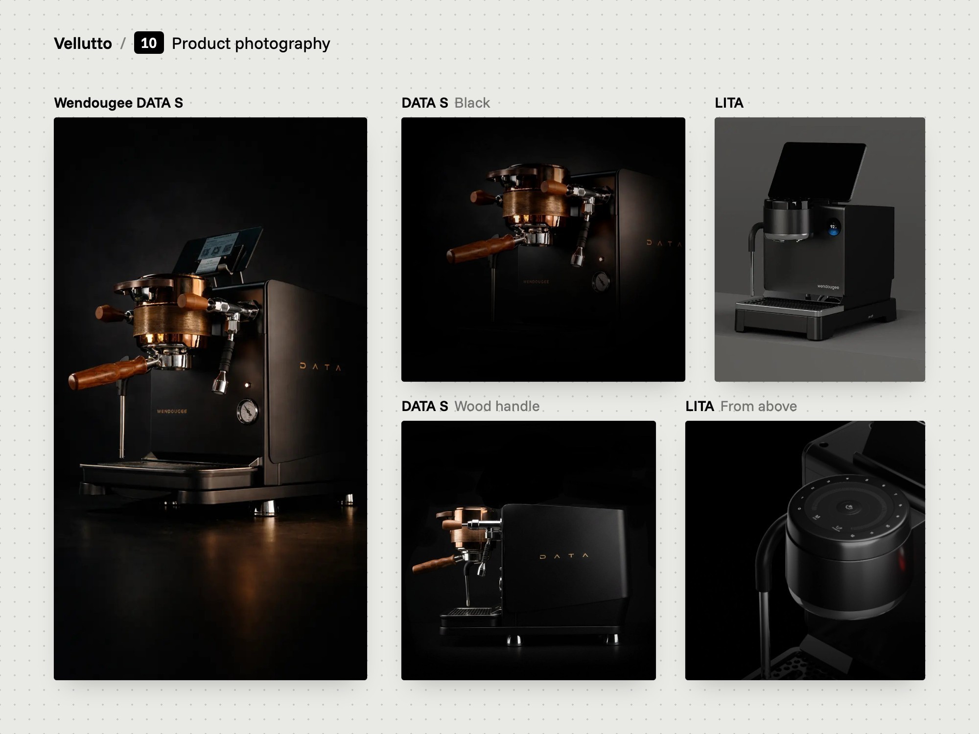
Product photography

The machines are shown low-key on black. Map It made a big share of the product images, and some came from the brands and the manufacturer.
Product photographs of espresso machines shot low-key on a black background.

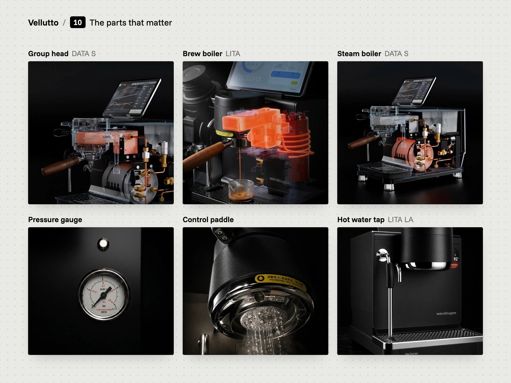
The parts that matter

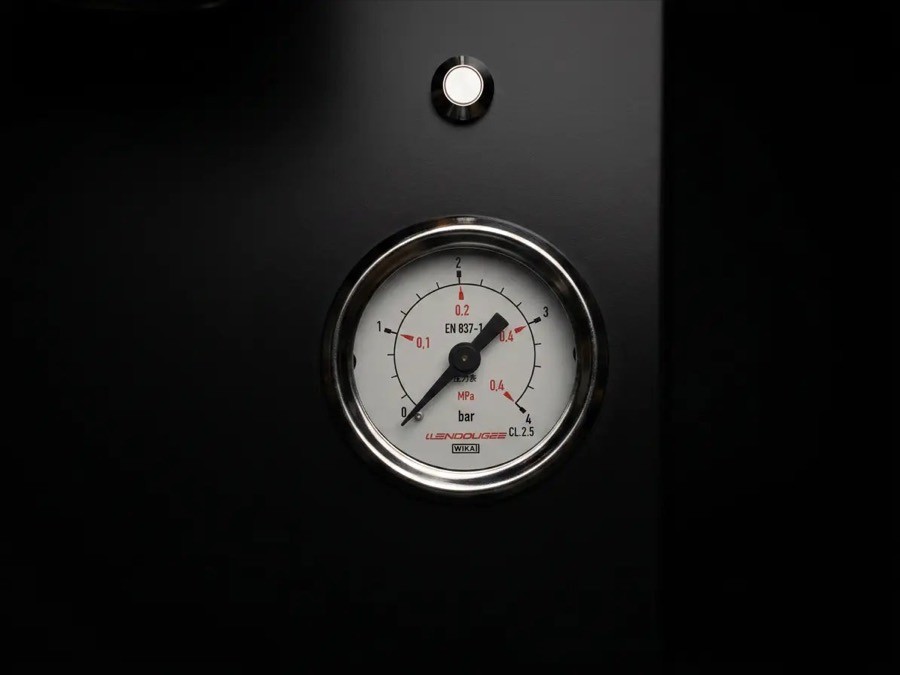
Close-ups show the group head, the boilers, the pressure gauge and the controls. Vellutto sells only espresso machines with pressure profiling, flow control or both, and these are the parts behind it.

Close-up photographs of group heads, boilers, a pressure gauge and controls on a black background.
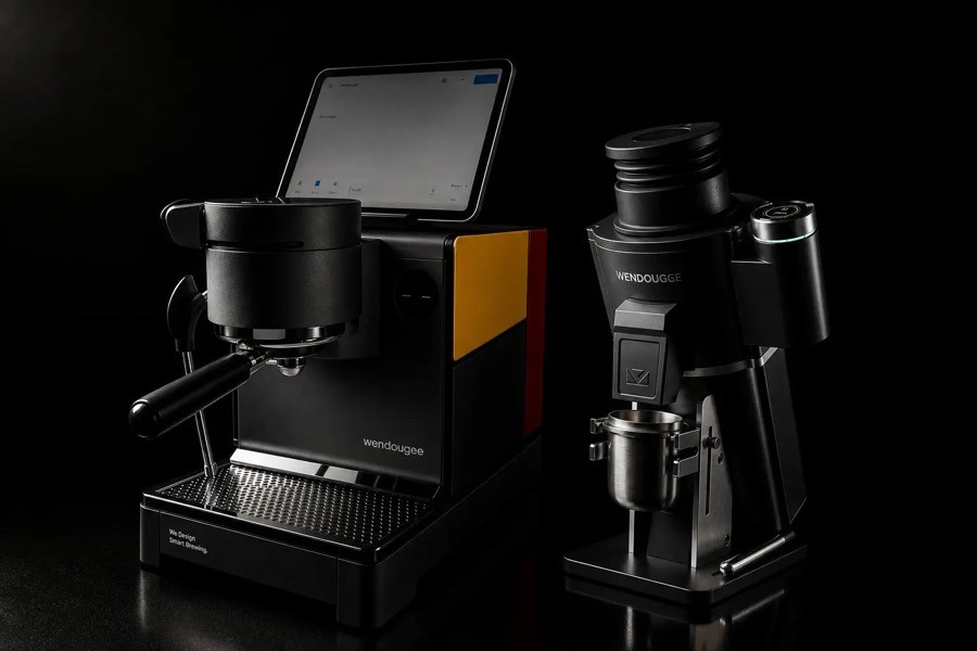
Espresso machines shown with their matching grinders.

Film

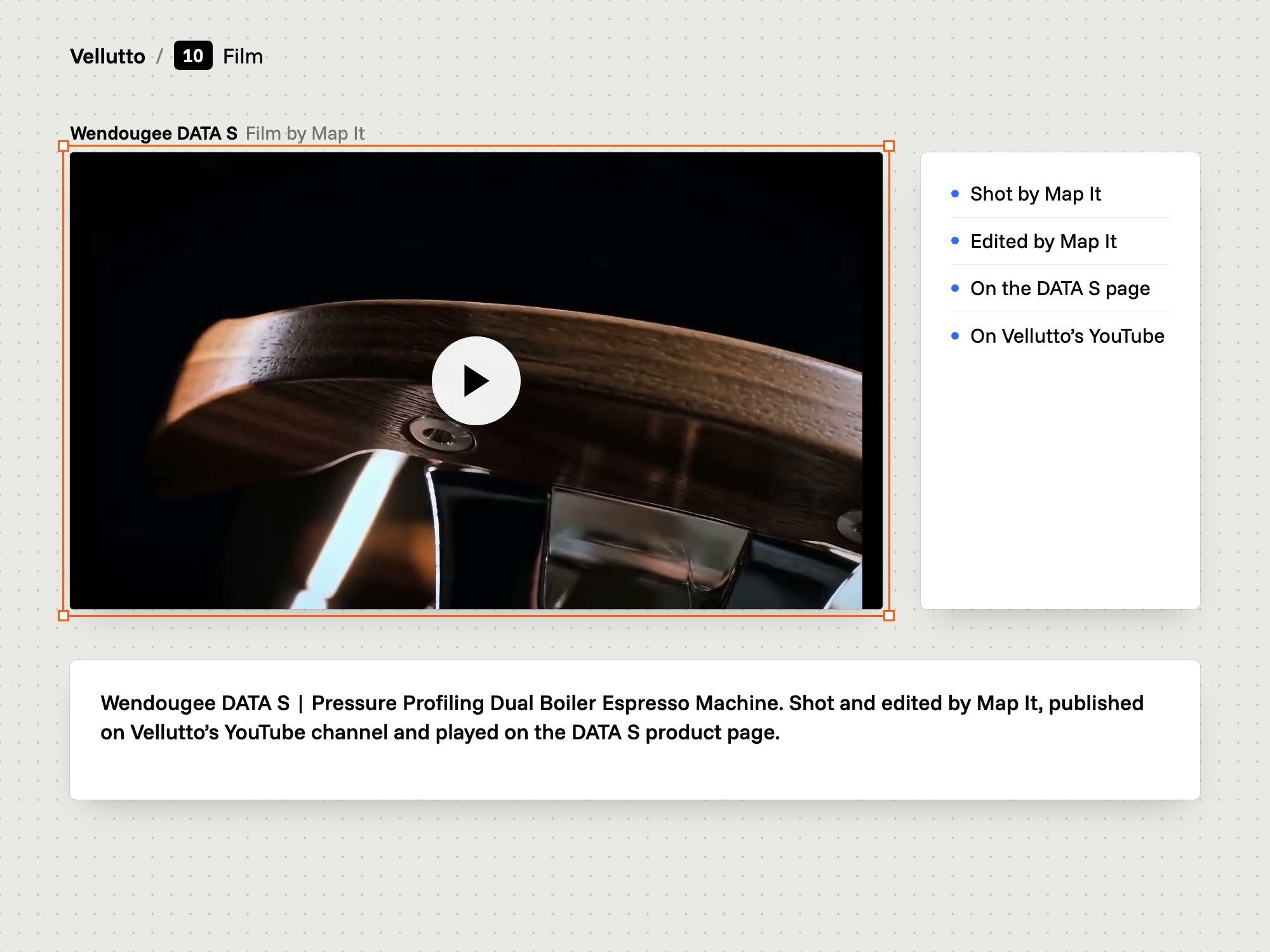
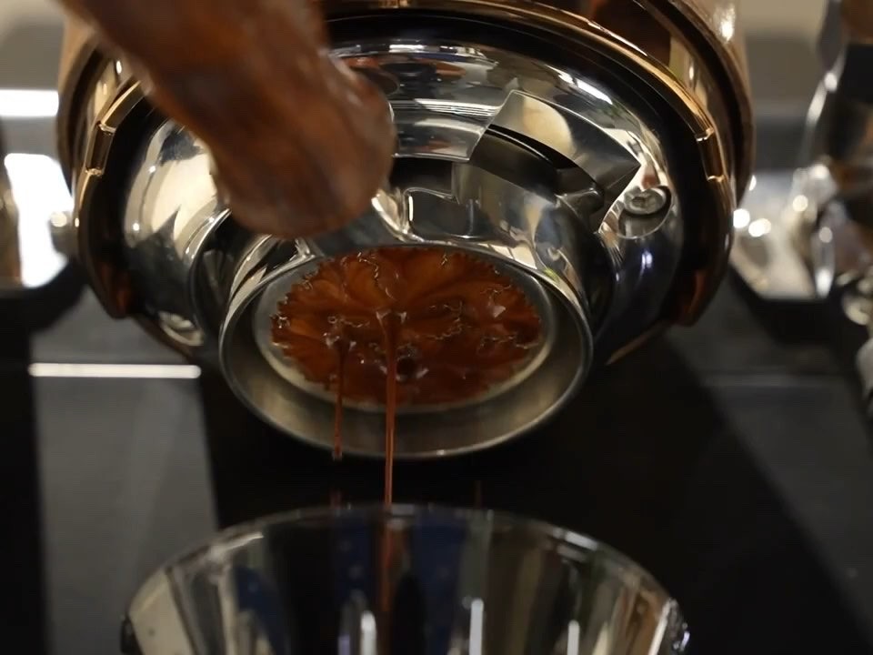
A film of the Wendougee DATA S, shot and edited by Map It. It plays on the DATA S product page and on Vellutto's YouTube channel.

Vellutto: the DATA S feature film
A still from the feature film for the Wendougee DATA S, with four frames from the film below it.

Result

A Shopify store, live since spring 2026.

After launch

The store went live in spring 2026. Map It tested it, set up redirects from the old site's links and handed it over to the owner. We still look after it.

What we delivered

  • Research: owner interviews, talks with real buyers, a competitor and market study, a review of the old site, and analytics with session recordings

  • UX and UI design: the menu, the product page order and where support sits

  • A Shopify store on the Concept theme, chosen, configured and arranged by Map It

  • A custom dial-in calculator section, with its Chrome extension and its iOS and Android apps

  • SEO and GEO: the copy, page titles and descriptions, the buyer FAQ and a fact sheet for AI assistants (llms.txt)

  • Product photos and the Wendougee DATA S film

  • Marketing and presentation materials

  • Testing before launch, redirects from the old site's links, handover to the owner and ongoing care

After launch

The store went live in spring 2026. Map It tested it before launch, set up redirects from the old site's links and handed it over to the owner. We still look after it.

Credits

Map It: research, UX and UI design, Shopify theme setup and configuration, the custom dial-in calculator with its Chrome extension and apps, copywriting, SEO and GEO, photography and film, project direction.

Part of the product images and the other product videos came from the brands and the manufacturer. The Concept theme is a third-party theme. Checkout, payments, markets and the language setup are Shopify's own. Chat, WhatsApp, reviews, the country and language picker and the FAQ widget are third-party apps that Map It chose, configured and placed.

Client

Case study: an espresso store built on Shopify, live since spring 2026

Category

Website

Year

2026

Services

Branding

UI and UX

Front end and back end

SEO and GEO

Photography and film

Contact

© 2026 Map It, KVK 98282859, VAT NL005321010B77

Cookies and storage

This site sets no cookies of its own. With your permission it loads the booking calendar straight away and remembers your planner and camera choices in your browser. Privacy and cookies